.post-body {font-family: Courier, monospace;}

Monday, March 31, 2014

Have a heart

This card was created after my class a couple weeks ago with Marjie Kemper.  The background color here is a bit more subdued when compared to the bold, saturated colors for the pieces we created in the class. 

Marjie provided us with a heart stencil, so when I came home I decided to test it out using the Golden Glass Bead Gel. It's a product I mentioned in one of my very first posts in January.  I also used it on a card recently, with a numbers stencil. 

The Golden Glass Bead gel goes on clear and when dry, leaves a layer of glass beads.  In this case I decided I wanted to have a purple glass bead heart. So I used the Distress Stains to tint the gel.  I applied a layer to the stencil, smoothed it evenly and then lifted off the stencil.  I let it dry overnight and finished by stamping hearts, adding arrows and a cute candy heart brad to finish it off.  


It's no irony that I love this heart!

It's my turn


So I am back and here is my latest addition to the book!  I don't know that my latest batch is up to the level of Marjies's work, but I can say that I am having fun working on them. 


So I used a favorite background from Marjie's class and stamped the circle - which is a clear stamp, making it easier to line up, then added some touches with the white Uniball pen. It's the best white gel pen you can get. Opaque and juicy, I love it. Don't work with this pen on paper that is damp in any way. It balks at that. I had to break out the heat gun first.  I also added color with the Distress Stains and dried each layer with the heat gun. It left a very interesting, saturated look. 

The definition memory was used because I layered inks using stencils in closely matching colors, so they are hard to discern. They remind me of an echo, of sorts. The plastic spinner is from Coffee Break designs. I purchased these ages ago, just glad that I get to put them to use. 

I will be rolling out one a day,  so see you tomorrow!

Wednesday, March 26, 2014

Face the facts

This is one of my favorite stencil techniques that Marjie showed us in the class.  I also saw this in the Creative Jumpstart 14 videos. 

You need a stencil, and the cut out pieces of the stencil, or the negatives that fall inside the outline.  In the case below, it would be the area between her arm and her body.  I first colored the card with yellow ink over the entire surface.  Then place the stencil image down (where the honeycomb pattern is) and then color around with inks, sprays, etc. Remove the stencil and then place the negative part of the stencil down, and line it up around the image (this would be anywhere that has the background with the orange ink color). Don't forget the small pieces of stencil between her arms and her body.  Now ink up the honeycomb background stamp in black and carefully stamp on top of the stencil, covering the open area on the paper.  It will appear to stamp the image only on her body.   


I think my explanation might be a bit difficult to follow, so I hope to find a stencil and demonstrate this in a video.  It's a bit confusing to explain with words, but if I can find and create the right stencil, it would be much easier to demo. 

The numbers on the left are done with the Golden glass bead gel. I mixed in some of the Distress Stain color in with the glass bead gel, used a stencil and applied it.  The glass bead gel normally dries clear, but this time it dried with the color of the ink, a purple color.  It's raised and when it dries it's really a great texture, somewhat translucent.  I applied a strip of skinny black masking tape and then found a watch face in my embellishment collection.  What better to use for a face, than a face?

I hammered the watch face a bit, because it had two prongs on the back.  When I folded them down to flatten them, it left bumps. The best way to mask a mistake is to make more of the same, and make it look intentional.  That's why the watch face appears a bit bumpy.

I even gave this piece a title.  


Tuesday, March 25, 2014

PARIS card


This one is simple, but I love it.  We colored the background with Distress Stains and then when it was dry, used the embossing folder to create the texture.  I was sure to place the ATC so that the word "Paris" was in the lower left corner.  

The last step was to use the Ranger ink blending tool, to add black to the high spots and highlight the dry embossing.  I found these collage elements that I had lying around that had a ribbon and a round medallion, so I cut out a piece from the tags we decorated (use shipping tags to soak up any excess ink when you are working with the Distress stains and dylusions inks).

More to come tomorrow!!


Monday, March 24, 2014

Putting fun purchases to use

So here is another completed card. I love the honeycomb embossing folder and I decided to go with this as the theme.  Marjie showed us a technique(kind of a throw-back to using markers on stamps) where you apply the Distress Stains directly on a large stamp, using various colors, on different parts of the rubber stamp. That's how I created the circle images, in more than one color. 
Marjie mentioned that you don't have to worry about contamination with the Distress Stains.  

The card had been stamped first, then dry embossed with the embossing folder.  Finally, you can lightly apply an ink pad over the top to hit the high spots of the embossing.


Then the embellishments, specifically I broke out the Tim Holtz Film Strip Ribbon. This was something Marjie had done on one of her pages, and I loved it.  I added Dymo label letters in each of the frames.  I used tiny brads to secure them to the page.


Marjie's class got me primed to break out my metal embellishments and put them to use.  My new goal for this project is to find the right one for each page I create. 

Sunday, March 23, 2014

Going back to basics

I have to say that the week did not turn out as expected. I had high hopes for spending time working on the new techniques from Marjie's class. Unfortunately, I didn't get time until the weekend. Hope you don't mind the wait!

This is one of the few cards I completed during the class. The reason is that I am not going to embellish a work coated in Ultra Thick Embossing Enamel (UTEE). So once it's heated and the embossing is done, it is complete. It stands on its own, flat and amazing. 

First I used the Distress stains to make a background. Then I used a wonderful spider-web stencil and then stamped the hand. The last step is to cover the work with a Versamark or other pigment ink that is clear. Coat with UTEE and heat. Repeated this three times to get this enamel effect. 

I don't know how long I have been stamping, but i never tire of watching embossing happen. 


Tuesday, March 18, 2014

Marjie's class at Great American Stamp Store

Here are some photos I took before, and during our class on Saturday.  We had a blast!!!  I can't wait to show you some of the works I created.  We made an accordion book with black card stock and then worked on ATC-sized cards.  It's a great size, and when the pieces are finished, we will mount them in the pages of our book. Nothing I love more than a small book format for artwork.  They are portable, interactive and compelling.


Brenda and Dottie when we first arrived at Great American Stamp store

Marjie demonstrating the ghost technique with Dylusions inks and stencils

I love the idea of blotting with a whole roll of paper towels!


Brenda, Dottie, Julie and Marjie after class


I have loads more to share.  We had five ATCs left unadorned after the class and I've already created some dreamy backgrounds using the Dylusions inks and Distress Stains.  Also, Marjie included a cool patterned paper and I used that on a few pieces as well.

Just like the weather-news folks love to tease for you to stay tuned, I'm taking a page from their book.  More to come  . . .

Sunday, March 16, 2014

Great things come in small packages

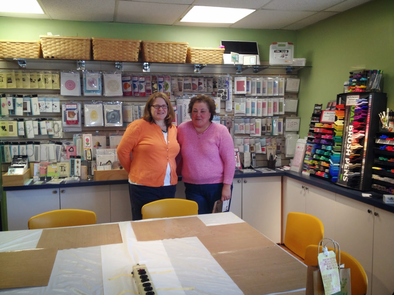
What an awesome day we had on Saturday.  My friend Dottie and I traveled to the Great American Stamp Store in Westport, CT to take a class.  We took a class called Demystifying Distress Stains & Sprays by Marjie Kemper.  Check out the following YouTube video where she shows a sample from this class:


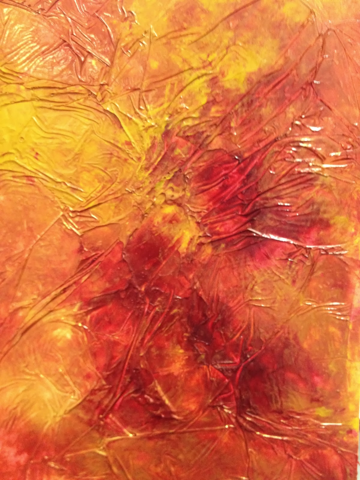
Here's a link to Marjie's blog, please take a look at her work, it's AMAZING.  I am such a fan.  She's so down to earth and really taught us a lot of great techniques.  I have so many ideas flying around my head and all I want to do is make art.  It was a blast to play with all kinds of fun products. I'll be working to complete the pieces I started in the class, and will post more about them in the coming week.    


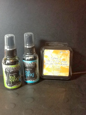
First things first, when we arrived our friend Brenda, who was joining us for the class, and works in the area, greeted us with these beautiful gift bags she decorated with one of the techniques we learned in the Creative Jumpstart class.  I LOVE it.  


Even the tag is beautifully embellished.  Then she included two bottles of the dylusions ink sprays and a Distress Ink!  I can't wait to put them to use and to show you what I've made.  


Finally, just a final thought about all the stuff we artists love to accumulate.  In preparing for the class I went through my supplies to pull out embellishments that I thought would work well for the class.  I went through my collection and was giddy when I stumbled upon a large box full of treasures.  I had watch parts, metal dog tags with sentiments, game pieces, metal letter stickers, keys and dozens of packages of cool things that I had accumulated.  I found this initially so exciting, but then I felt a bit sad to think I had all this stuff just stashed away.  

So for all you fellow artists who love to collect things for future projects, join me in my mission to try and use up all my stuff and make great art with it.  I don't want these wonderful embellishments to be locked away, I want them to be used, loved and "employed" in some meaningful way.  It's a goal I have, just like taking all my boxes of photos and putting them in albums. Use them or lose them, quite literally.

Thursday, March 6, 2014

Pillow Talk

I try to work out at the gym daily.  It goes a lot faster when I have something fun to watch while I'm walking the valley of the treadmills. Since exercising prevents me from making art, I thought I'd do the next best thing and watch videos that would inspire me.

Somehow I found Teesha Moore's series of YouTube videos on making creative journals. There are episodes about making fabric covers for the journal. The fabric covers consist of "pillows" that are small quilted pieces, each of which will be stitched together to become a cover.

I got home, dug out the fabric pieces (fat quarters) that I had stashed away and started to make some.  I love the rustic and simple nature of the pieces.  I like the uneven edges, large stitches and hand made appearance.  I only have three so far.

What is truly freaky is that my pal Jo-Ellen happened to mention she was in a swap and guess what?  She's making the very same pillows to swap, based on the very same videos from Teesha.  How odd is that?

So here are mine:


Here's the link to Teesha's fabric journal workshop videos.  Check them out and I think you'll find yourself rummaging through your fabric stash to try it out.


Wednesday, March 5, 2014

Okay, more on library books

Okay, another new favorite book (I just love my local library):

http://www.amazon.com/Journal-Fodder-365-Inspiration-Addict/dp/1440318409/ref=sr_1_1?s=books&ie=UTF8&qid=1393945541&sr=1-1&keywords=journal+365


Kudos to my pal Brenda, who originally gave me the idea to check the local library, after arriving for visits brandishing all kinds of cool books she'd found at hers.  Now, I'm on board with this green, money-saving idea.  However, I love this book so much, I am putting it on the wishlist.  There are some prompts and techniques in this book, as well as design ideas for pages. 

The book offers a kind of "format" for the layout of journal pages, just in case you want to shake things up a bit.  It's a very inspiring book and the true testimony to that is that while reading it, you want to break out your own journal and play. 

That is great inspiration!!

I'll have to show and tell some of the ideas from the book, that I've used in my journal!  Also, the authors have a retreat and I might have to consider it in the future.  Here's a link to their blog:

http://www.journalfodderjunkies.blogspot.com/

Check it out, you'll be inspired!

Tuesday, March 4, 2014

Paint technique

I LOVE my local public library.  They have a web site that you can search to find books to borrow. You can request them and they will get them from surrounding libraries and hold them for you to check out.  You can easily renew them as well.  It just makes it so easy.  

The number of titles they have is quite impressive.  All kinds of great craft and art books on topics like Zentangle and art journaling.  I've really checking out books to get ideas.

A couple recent books I've checked out recently:

Claudine Hellmuth's Collage Discovery Workshop: Beyond the Unexpected.  It's not new, it's from 2005.  

http://www.amazon.com/Collage-Discovery-Workshop-Unexpected-Techniques/dp/1581806787


There are some fun techniques in this book.  One that I felt compelled to try from Claudine's book is a background technique.  I used a red and gold acrylic paint, brushed on card stock and while wet, covered with plastic wrap.  You then squish the paint around while it's wet, mashing down the plastic wrap.  Set it aside and when it's dry, pull off the plastic wrap.  It ends up looking plastic, textured and wet.  It's cool!!

Take a look at the sample:


Try it out!